
Description:
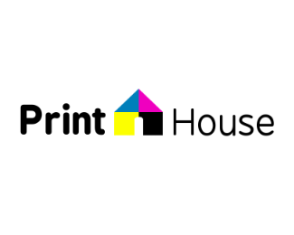
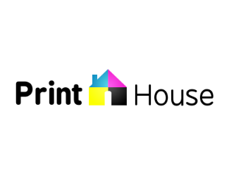
This is a logo i just made its pretty simple the mark is supposed to be drop or ball of fire. critique plz this is v2
Status:
Nothing set
Viewed:
1290
Share:



Lets Discuss
any critique
ReplyWhy is the lettering going downhill?
Replykerning.
Replyit is slightly slanted? if thats what u see that was intended idk why i did it looked nice any other critique
ReplyPlease login/signup to make a comment, registration is easy