
Float
(Floaters:
0 )
Description:
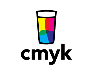
They needed a bold and creative brand that was corporate and attractive to their conservative client base. The lowercase k/c combination is clever and clear in its form. The pattern created is memorable with impact and the stationery is clean. There is no strong trend or style which makes this brand versatile to the market and timeless.
As seen on:
A3 Design
Status:
Client work
Viewed:
1944
Tags:
C
•
K
•
Logotype
•
Design
Share:


Lets Discuss
Please login/signup to make a comment, registration is easy