Float
(Floaters:
18 )
Description:
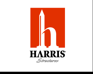
Here is another variation of the HARRIS logo project
Status:
Unused proposal
Viewed:
5480
Share:


Lets Discuss
I like the shadow detail where the arch meets the pencil - makes it kind of monumental. Not sure if 'structures' should be pencil written.*
ReplyThanks guys...**Firebrand: Yeah, the scripted %22structures%22 was just another option.**Relevant: At this point I am paying them...just one of those clients. I might just keep the deposit and move on with this. At least I have some nice portfolio pieces huh?
ReplyYeah, that is exactly how I have been presenting a long line of good comps. I usually call it a %22comp series%22 and show all the different avenues of comps I created for one specific project. I think it really helps show versatility and your broad range of creative thinking.
Reply3 concepts is pretty standard wouldnt you say? This is my favourite symbol of the lot however there are some dirty curves in the middle, perhaps its image quality though.
ReplyOh yeah at least 3. BUT...if you feel you have 3 very strong concepts then I say showcase them to potential clients. Again, it could show off your diversity and versatility.**Dirty curves: I think it is just the image quality...which I don't know why, I've been saving them at the highest jpeg setting.**Thanks for the comment.
ReplyOH! one more thing on that...*Most peopl liked the see through 3D %22H%22 comp I did (first one) and you liked this one best...If I would have only showed you the first one I would have missed your approval on the whole project.*I think showing a series could help you impress a broader range of potentials.
Replynice. this reminds me of a logo I did a few years ago: http://logopond.com/gallery/detail/2575
ReplyYeah, very cool. I like the style you implemented in yours. It's a bit more illustrated then mine.**Great minds think alike.:)-)
Replylove it !
ReplyPlease login/signup to make a comment, registration is easy