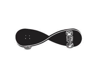
Description:
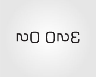
This logo is for a small, local skate shop. They already had the name, so the concept was just sitting there.
Status:
Unused proposal
Viewed:
6791
Tags:
idea
•
concept
•
style
•
twist
Share:



Lets Discuss
Knarley!
ReplyI like this version a lot better than the other. I dig the illustration on the wheels. Nice job.
ReplyHA!!! Mike, you're consistantly crackin me up lately. Thanks!**Thrasher:*Thanks a lot!!!
ReplyThis is sweet ahab, where is this skate shop.. I would love this logo on a shirt!
ReplyReally clever! Some of your curves look like they could use some slight refinement, but it's great nonetheless.
ReplyThanks a lot, guys!**@Logotivity: The shop is in St Louis MO and yes, I would love a t-shirt of this too. Thanks!!**@sdijock: You're right. I am still playing with the details. Haven't decided if i'm going white, black or full color on it too. Thanks for the input and compliment.
ReplyGreat call, absoludicrous*Something was bothering me about the balance of the entire mark too. How's that look? Feels a lot better to me.**Thanks.*
Replygreat work, and I like it the way it is, that wheel on the left side works for me, it makes the perfect balance
ReplySweet work Ahab
ReplyThanks guys! I really appreciate it.**@rincon: I actually updated the image and moved the left wheel down a bit after asoludicrous' suggestion. It did help. Thanks.**
ReplyHow cool is that...............
Replyoh yes! :D
ReplyThanks!!
ReplyVery coool!
ReplyJust amazing work. Really great illustration!
Replythat illy is awesome, but at a small size it doesn't translate. not saying you have to ditch it or anything. I would recommend going with the text only at a certain size and smaller. and that illy would be great as a large watermark behind the small text. no whatta mean? love it. truly. :)
Replythanks guys!
ReplyTHEArtist: All great and true points. thanks for your input and kind words.
Please login/signup to make a comment, registration is easy