Description:
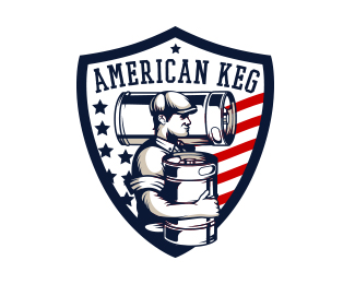
Logo design for American Keg
Status:
Client work
Viewed:
2850
Tags:
•
america
•
america
•
flag
Share:





Lets Discuss
Your illustrative work is fantastic! But the execution of the name placements is just a little off. It's like you spent so much time and care into the illustration and then just quickly slapped the wording on. That is evident in most of your pieces. It's much more obvious in this one. I would suggest reducing the size of the illustration within the shield a little to allow room for to expand the top of the shield to incorporate the name into it. Even as a negative inside the shield. Atm it just seems to be floating there.
ReplyLastly, your work is too nice to be displayed like that. Add some space all around when uploading your logo.
Thank you chanpion for your advice, they are really helpful.
ReplyI know that I have to work harder on fonts, and I am working on it.
@AIex No probs mate. I have aspects of my work that needs working on too ;-)
ReplyPlease login/signup to make a comment, registration is easy