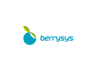
Description:
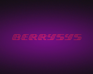
*updatet* Made some changes regarding the custom typography. I've reduced the thickness of the lines to achieve a better readability and balance between mark and typography. The type is italized now.
As seen on:
http://dribbble.com/alexwende
Status:
Work in progress
Viewed:
5153
Tags:
alex
•
wende
•
logos
•
identity
Share:

Lets Discuss
I like the attempt with the custom lettering.*However, my humble opinion is - and here I would like to point out that I'm not a designer/graphic artist by profession -, that making the 'y' the same height as the 's' and using the same lower curl in both letters in the exactly same position makes the 'ysys' part a little bit confusing(not that pleasant to read). I wonder what it would look like if the upper part of the 'y' would be more extended, with the lower curl sticking out slightly from the textline.*Anyway, these are just some 'first sight' ideas :)
Reply*updatet* I think you're right, it's more readable with a more common aproach for the %22Y's%22 Thanks for the feedback!
ReplyI drivvveled on dribbble.
ReplyLike it much better now :)
ReplyThanks! I've *updatet* it and made some changes regarding the custom typography. I've reduced the thickness of the lines to achieve a better readability and balance between mark and typography. The type is italicized now. Thanks for the feedback Chanpion!
Replyvery good readability ... very nice upgrade ... like it this way !
ReplyNice Alex this type has a style!
ReplyThanks guys!
Reply*updated* the *colors* / less fruity %26 warm colors - changed it to a more cooler color palette. I think the cyan goes well with the greens. Curious about your opinion, what do you think?
ReplyNothing to say, it is just fantastic!
ReplyYes, spot on brother. Love the new colour.
ReplyPlease login/signup to make a comment, registration is easy