Description:
personal logo
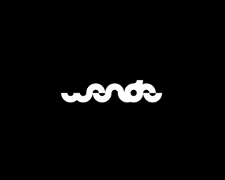
My name is AlexWende & "Wende" is german & stand for "turn/u-turn"...
I tried to use one simple half circle to create the typography.
Status:
Client work
Viewed:
19862
Share:
Lets Discuss
This is nice Alex. I read wende straight away. The only problem I feel is the 'w'. its not height proportioned as the rest. dunno how you can fix it though. Cheers.
Replyvery interesting, nice work!
Replyi agree with chanpion..%0D*gr8 work.. hugs :)
ReplyThanks for the feedback! %5E%5E%0D*%0D*@chanpion %26 abu4net: I'll try to manage this, maybe the %22w%22 will do better than, thx!
ReplyThis is not ledgible at all.
Replyi second that...
ReplyYea, I third that. The concept is great by using the half circles to represent 'U-turns'. However, the legibility is way too poor and it just doesn't flow well in regards to form.
Replyi love it %3B)
ReplyI saw it straight away! Great concept.
Replysince its a personal logo and theres no need for someone to understand it its ok :) its trendy
ReplyI guess I prefer timeless before trendy.
ReplyPersonal logos still need to make a understandable impact and or make sense however. I guess I also prefer timeless rather than the next trend.
ReplyI think it is a great concept, just needs to be reworked a bit. I agree with you, I have a hard time designing things for myself as well... Sometimes I almost would rather have someone else do it, otherwise I will just change it, and change it and then maybe change it once more!
ReplySch%F6n gemacht : )
ReplyI actually love your simplified user icon.
ReplyThx, I was inspired by nidos user icon as I designed my own :D
Replyuser icon is nice, would like to see the main logo without the breaks? nice though
ReplyReally interesting...
ReplyVery nice showcase Alex...
Replythank you, logopunk. I'm kind of still like this since it's minimal as a font can be. Thank you fashion blog %26 webing! :)
Replynice one!*and your avatar is hilarious :D
Replythx leo %3B)
ReplyInteresting concept alex..
ReplyCongrats on the feature bud!! Well done :)
ReplyCongratulations Alex, you're too early must be selected. :))
ReplyCongrats big man!
Replycongrats Alex!
ReplyCongrats buddy :)
ReplyCongrats Alex
ReplyCongrats A dawg.
ReplyCongrats slick :D
Replybig congratulations Alex!:)
ReplyCongrats Alex, my good man! Very much deserved!:)
ReplyCongrats Alex.
ReplyCongrats! Good works!!!
ReplyCongratulations my friend! Well deserved! :)
ReplyCongrats Alex, you have brilliant worx.
ReplyCongratulations :)
ReplyMany more awesome projects, buddy. Congrats.
ReplyWell done on the feature, great portfolio.
ReplyCongratulations! No jokes :D
Replyhell yeah! you rock!
ReplyCongrats Alex!
ReplyOMG! I hope that's not a April Fool's joke %3B)**Wow, I am very grateful for the feature! Thanks so much for your congratulations also.
ReplyNice work...Congrats on the feature!
ReplyHey, congrats, Alex!
ReplyJoining the party, gratz buddy! Just realized that you're here since 2007! :)
ReplyBig time CONGRATS, man. that is awesome. well deserved. oh yeah! :D
ReplyCongrats Alex!
ReplyCongrats on the feature. **Wohl verdient.
Replytop stuff
ReplyGRATS!
ReplyCongrats Alex!! :)
ReplyCongrats Alex!!
ReplyCongrats Alex :)*
ReplyCongrats, bud!
ReplyCongrats DoubleU! Love Your %22Name Logo%22! WUNDERBAR!
ReplyCongrats Alex! :D
Replythx a lot @ all! :)
ReplyCongrats buddy!
Replycongrats Alex, deserved well and nice choice of the judges :)
Replythx Mel %26 Thomas! I'm very happy about this feature! At the same time I think there are a lot designers on logopond who deserves to be there too!
ReplyAlex, better late than never, congratz on the feature man, great stuff and great work!!
ReplyHappy to see you on the front page! Good job!
ReplyCongrats on the feature buddy! :)
ReplyGreat identity, Alex!
ReplyLove the simplified version on you user thumbnail.
ReplyPlease login/signup to make a comment, registration is easy