Description:
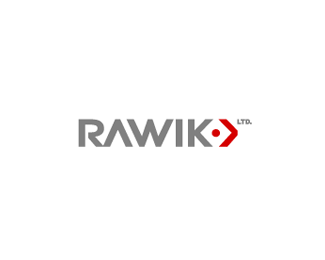
Japanese import & export company. They also help japanese and western companys with their business overseas. Custom Typography
As seen on:
www.rawik.com
Status:
Client work
Viewed:
7453
Share:


Lets Discuss
Very good Alex, very good! I totally see this logo on those huge containers on ship docks (or train wagons, trucks, vans). The only thing that bothers a bit is connection between R and A, personally, I would put some more space there and match it with the overall kerning... (now when I look at it, W and I space could be fixed a tad as well) :)
ReplyThis is cool.. I don't have much of a prob with the kerning.. I think every letter and its negative space feels pretty balanced to me.. but it's subjective. nice job..
ReplyThe kerning looks fine to me too. Great solution. The arrows symbolize importing and exporting, while the center dot and the colors reflect Japan well. Great job solving the problem. :-) I also like your attention to detail. The right edge of the red arrow and the center edge of the R seem to match intentionally.
ReplyLove it as is. Strong elegant solution.
Reply%5EDitto to logoboom's comments
Replythx everyone for the kind words.**@ alen: Thx for your input! This two parts you pointed out were hard to kern, I wanted the spaces a bit tighter than wider. **@ kevin: I'm glad that the concept works! :)
Reply!
ReplyPlease login/signup to make a comment, registration is easy