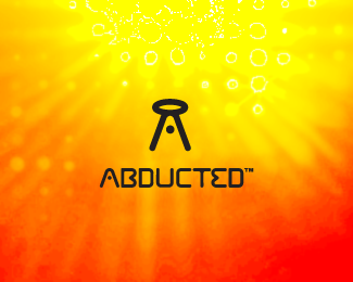
Description:
Abducted - now with typography
As seen on:
theyabducted.me
Status:
Nothing set
Viewed:
4710
Share:



Lets Discuss
I love this! One of the best concepts of yours IMO! It is totally clear that something is being lifted towards the 'ship' and the whole graphic forms the letter A, marvelous! Only one small thing, to make the complete balance, what do you think about putting that little dot in the letter 'A' in the text as well?
ReplyHey Type! Thank you very much, I'm really appreciate your opinion.**I've updatet the %22A%22 and I think the typography is more balanced now, not sure whether it's distracting from the mark or not. Any thoughts?
Replygreat
ReplyThis is embarrassing, but when I saw this before a while back I didn't get it, I just couldn't see it. Now I see it! Good one.
ReplyGood one!Brilliant concept!
Reply%5E agreed!!
ReplyThank you all!
ReplyThis is it man, I think ti works very nice adjusted this way!
Replyawesome concept and execution.
Replyclever...
ReplyNice one, Alex.
Replylovely mark, great type, but that background hurts my eyes :)
ReplyThanks everyone! **@Tomme: lol, thank you!**You should check that out: abductionlamp.com*
ReplyGREAT! i love this. i think the one thing i would change is to make the oval ufo thing look more like a ufo than just a sideways oval. i dont know how but i bet you can figure something out.
ReplyI love this font. What is its name?
Replythank you, the font is custom made :)
ReplyPlease login/signup to make a comment, registration is easy