Description:
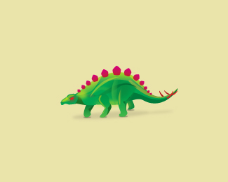
A little funny animal i created to practice my illustrative skills. I'm aware that this have to be simplyfied before turning into a logo. Feedback is welcommed anyway.
Status:
Just for fun
Viewed:
4067
Share:


Lets Discuss
I think it has to be simplified before turning it into a logo...just kidding Alex :) Looks really cool, just not sure how well the pinkish color works with the green. Maybe just a darker green fro the spikes would do best.
Replynice illustration... wouldn't work thought as an Identity piece as it stands but will be interested to how you simplify it. Stegosaurus kicks ass.
ReplyThanks guys. *Joe - Haha, you got me worried %3B) I agree, and i certainly have had my problems with those spikes, the do not feel very connected to the rest of the body at this moment. **Mcdseven - Yep they do, i've been amazed by them since i was a little child. I am looking foward to simplify it, but the tail is gonna be hard, and also i don't want to get to close to the rentzilla logo by brandberry.
ReplyStegosaurus' Rock (second to velociraptors of course), and this one is no different!**I'd agree with Joe to adjust the colours a bit, but I think its a brilliant little illustration, does it even need to be a traditional logo?
Replyvelociraptors rock too, especially their %22claws%22**Well it does not necessarily need to be a traditional logo, but i think there is too much detail here, even for a illustrative logo. **Funny thing: try staring at it's eye for 30 seconds, i swear it will start winking at you. %3B)
ReplyCool !! i really like the effect
ReplyIt's beautiful, mate. I love it :)
ReplyPlease login/signup to make a comment, registration is easy