Description:
Boston
Alphabet Arm's design installation at the Paradise Lounge
As seen on:
Status:
Client work
Viewed:
1538
Share:


Lets Discuss
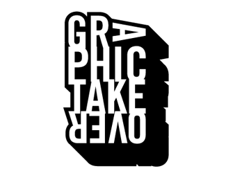
Nice logotype. I might have eliminated that small white slit/part at the bottom of the logo ( below the 'O' and 'V' in 'OVER'. It seems unnecessary. Even so, I like your thinking on this one.
ReplyThanks OcularInk, we are big fans of nice typography and adding dimension.
ReplyPlease login/signup to make a comment, registration is easy