Description:
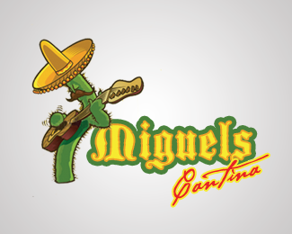
Logo concept not chosen. Collaboration with an amazing illustrator, Dave Turton. Check him out http://www.thinkinsane.com
Status:
Nothing set
Viewed:
5363
Share:


Lets Discuss
%22ahhh the scriptina is killing me :D%22 - me, too... :)
ReplyGreat illustration, have to agree with type's kill ratio!
ReplySorry for the discomfort :) I agree, the script brings the logo down. I had done this logo over a year ago before knowing much about type faces and overused bad fonts. I don't usually alter previous works%3B It allows me to see my progression. However, I made a quick change so please let me know if you like the type change any better.
Reply%22ah, thats a better script%22 - I second that... :)
ReplySorry... Logo down!*I liked so much of illustration, but the type, in my opinion is bad... so bad... i don't think in this logo in the gallery, but...**%22Miguels%22 is ok, but... %22Cantina%22...**Anyway god job!
ReplyPlease login/signup to make a comment, registration is easy