
Description:
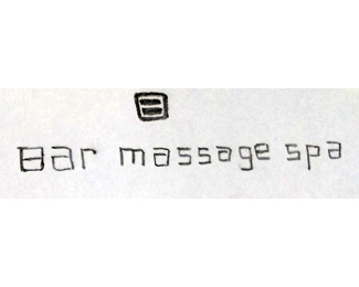
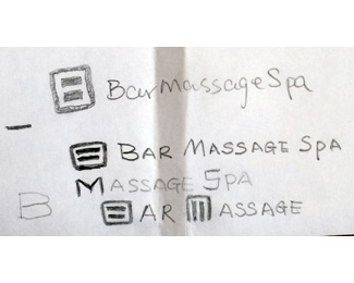
Working on my own logo. The bar massage means Ashiatsu massage it also called bar therapy. It utilize two parallel bars hanging on the ceiling of the massage room to do the massage.
I am trying to use the letter B to symbolize the two massage bars, if the letter M can be Incorporated will be great.
I also want to grade my therapist to different level. I want to use two bars to four or five bars for different grade. (this is not necessary but will be a big plus).
Any suggestion via public or private message will be great appreciated.
Status:
Work in progress
Viewed:
727
Tags:
typography
•
M
•
Letter B
Share:
Lets Discuss
I love the concept you're working on, if done properly this will be one hell of a logo (: I would try to keep the organic feel to it (without it feeling all messy and sketchy as it is now).
ReplyThank you for your encouragement, ivis.
ReplyAny more criticizing on this concept?
Thank you again.
I understand the message of the logomark (B, two bars), but not sure that there is no logo out there that looks exactly the same - it's kind of a basic shape. What I may suggest is to (if you want to keep this idea) create a superb and unusual execution that will help to distinguish it from the other similar concepts.
ReplyIt's similar to the Human Rights Campaign logo.
ReplyPlease login/signup to make a comment, registration is easy