Description:
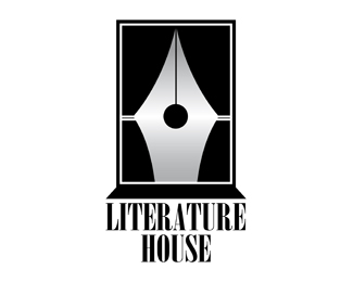
The logo is generally a stylus (a symbol of the literature), but ...
you see a window with the curtains open.
inside the house there is a simple ball-shaped chandelier.
Status:
Just for fun
Viewed:
4834
Tags:
home
•
literature
•
stylus
•
window
Share:


Lets Discuss
Been done: http://logopond.com/gallery/detail/91503
Replythanks for the comment.*The concept is similar, but the graphics are different.
Replyone was for fun, the other for sale**
ReplyHadn't noticed it was marked for fun :) Just sharing.
ReplyThe issue I meant to highlight is that a business can take and use this concept in a logo, have the trademarked registered -- and then the original 'for fun' and 'for sale' logos would have no merit.**I say this from experience on both sides of the fence*
Replythis is a coincidence.*I do not want war with other designers.
ReplySigh.
ReplyMine isn't marked as %22For Fun%22 on purpose. No idea why it's like that. It's currently in use by a client. Guess I marked it that way by accident.
ReplyHi, thanks for your comment!*Please do not accuse him of copying.*We can solve everything in the forum**http://stocklogos.com/topic/dead-or-alive-2**My respect for you, great artist
ReplyI invite everyone to decide life or death of the logo
ReplyDeath.
ReplyThank you*Please comment here*http://stocklogos.com/topic/dead-or-alive-2
ReplyStockLogos? You're kidding right?
ReplyThis is where you posted, so we will speak right here my friend. Don't run to another site.**I think you should remove your logo since Tabitha Kristen's logo was not designed for fun and is in use by a client. If you have any respect for yourself and others, delete this logo.**I noticed StockLogos is destined to be the next Srandstack. This is where you are headed.**http://www.logodesignlove.com/brandstack-closes
ReplyRaja, thank for your comment, but yesterday it seemed you were saying the opposite!
ReplyApplex my friend, apart from the execution, these two are pretty much the same. No one is accusing you of plagiarizing, just leave it as unfortunate coincidence, great minds think alike, whatever suits you, just scrap it and move on.
ReplyYes, unfortunate coincidence. but on the page of stocklogos accuses me of copying.*This is not right!
ReplyJust delete it. Mine is in use by a client. You start a thread on stocklogos.com and ask if you should keep it and it's obvious to me that the forum is nothing but a popularity contest judging by the answers. I guess I can't really expect any better from a website like that. Jerk move dude, jerk move.
ReplyOk, stocklogos.com removed his copy so, game over.
Replyapplex, yesterday, as Tabitha stated, her logo was marked differently by accident.**I did not change my view.**This thread is not going to win you any clients.
ReplyThe game is over!
Replymy bad. I should always check comments before floating!
ReplyI thought logo marts went by way of the dinosaur.
Replynope and stocklogos is a pretty bad one.
ReplyI believe that there is another logo %22Stylus Curtains%22*http://www.web3mantra.com/2011/01/28/30-best-logo-designs/*http://web3mantra.com/wp-content/uploads/2011/01/writers-show.jpg**Peace!!!!
ReplyPlease login/signup to make a comment, registration is easy