Float
(Floaters:
44 )
Description:
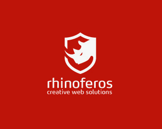
logo for a swiss web design agency. "Féroce" in french means "fierce".
Status:
Client work
Viewed:
17244
Share:
Lets Discuss
cool mark and nice type.
ReplyI agree with logomotive. Nice work :)
ReplyIn one block! Good client work.
Replyfantastic
ReplyI see it more has a security company security web service it's too serious or too ecstatic. The color red and the shield plus the rino gives even more that idea.*Maybe if you give some kind of a twist or add a playfull detail that idea will change. After all web design agency provides creative solutions..
ReplyI like the mark and type, but agree with pictofactor that it seems more suited to web security.
ReplyThanks! I updated the description to explain why it's red and white. Merry Christmas! %3B)
ReplyHello! Nice mark! Just an idea, what if you broke the lines of the shield on the right side as well, where rhino's head is? Same way as on the left. This way it looks a bit odd to me, like a part of the rhino figure and then he cut the part of it out himself...
ReplyThe updated description makes the idea behind the mark clearer.
ReplyIt makes sense.
Replylooks very smart, and memorable
Reply
ReplyThe type used looks great with the mark, great work*
Replycompact design and giving the feel of 'POWER'
ReplyI'm a sucker for well-executed shields... especially when the negative space within is so well thought out.
ReplyPlease login/signup to make a comment, registration is easy