Description:
Lion.
Status:
Client work
Viewed:
6564
Tags:
Artgeko
•
Animal
•
Lion
Share:

Lets Discuss
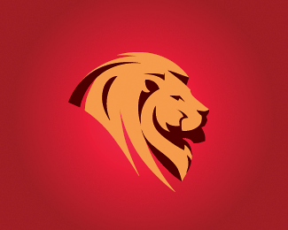
I really like this! You came up with a nice solution for dealing with the general shaping of the mane, it's clean but doesn't seem to take away from the visual identity of "lion." One thing though, the shaping of the mane under the jaw I think could use a bit of tweaking. It looks like there's a dark notch there to represent the shadow of the face on the mane, however, that "shadow" combined with the overall shaping of the front portion makes it look a bit like the lion is wearing a scarf.
ReplyI'm not sure exactly what you might do to change it up, perhaps on that front-most contour instead of a smooth curve you could echo the "corner" appearance like on the opposite side at the back of the lion's neck? It might take away from the *literal* appearance of the lion (looking true to life) but enhance the *perceived* interpretation of the lion (a.k.a. people will see "lion!" not "lion! wearing a scarf?" lol)
Just my 2 cents, like I said, it's a really nice piece even without any changes.
Very sorry about the multiple posts!
ReplyThank you for Your comment Virginia! Hoping that someone will Express his opinion, because the work is now in the process of formation of the image and correction of details, including those about which You have mentioned. In any case, I will improve, because the task was - create a recognizable image of a lion with a minimum number of parts.
ReplyPlease login/signup to make a comment, registration is easy