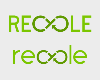
Description:
This is a logo I am going to be using for a design site that will focus on using trash/recycled things to create new objects. One such project I am working on is a lantern using recycled steel rod, LEDs, and paper. This logo is pretty much set, but I wanted to see what Brandstackers thought of it.
My idea behind this is the "re:" is like in an email, a response and the "CYCLE" is giving things ("trash") a longer life cycle, as opposed to being put in a landfill.
Status:
Just for fun
Viewed:
2769
Share:


Lets Discuss
I love the caps one. I think you might need to add in another arrow or two somewhere but I dunno if that'll be too busy but I think it'll help with the flow of the infinite symbol. I really like it as it is though.
ReplyPlease login/signup to make a comment, registration is easy