Description:
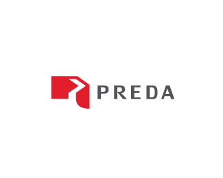
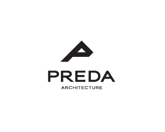
Logo proposal for an archtectural/design studio called Preda. The client request a simple and geometrical look. Hope you like it. Criticize will be very appreciated :)
Status:
Work in progress
Viewed:
1810
Share:

Lets Discuss
I'm having trouble making out the mark, but visually it's stimulating. Digging the type too.
ReplyThanks for comment, Kevin. **I try suggest a house, a bit of extrusion, geometric feel, i know, its a bit confused yet.
ReplyI agree with Kevin, the mark works visually well, and a nice type to go with, but can't really get it.
ReplyYour mark really have geometrical feel, btw nice type :)
ReplyNo idea what it is but it looks cool.
Reply%5E Hahahahs how i said, its a mix of a geometric forms, a house and a abstract P. But its really confused, subjective at all... Thanks mates!
ReplyPlease login/signup to make a comment, registration is easy