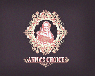
Float
(Floaters:
52 )
Description:
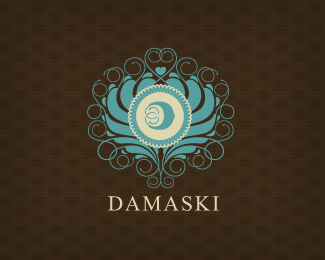
Logo for a tea coffee and accessories webshop, need some critiques, please! :)
Status:
Work in progress
Viewed:
5513
Share:


Lets Discuss
amazing logo:) but not sure about collors:)
ReplyHaha, thanks mate.*I'm not sure about the colors too, maybe i will try some 'pale' colors instead that. Any suggestion?*
ReplyI've the same opinion about colors. They already look pale and washed out. I think u need to try to bring in contrast! :)
ReplyThe attention to detail %26 artistry is phenomenal mate!!**But I agree with the other guys...not enough contrast between colours, for example%3B the face is getting lost as it blends with the background...it needs to jump out %26 say %22this IS the best cup of tea!%22 :)
ReplyThanks for the tips, Hayes. I'm now trying another color combo here :)
Replyou! great ornaments! very nice compozition! great work, mate! choose right colors %26 logo will be OMG :)
ReplyOh thanks, Deiv! i'm now a bit tired of look on this proposal, so its hard to say that i love the colors haha, will update in few minutes the colors.
ReplyReally a classic Breno, well done!
ReplyBreno Breno, this rocks! I actually love the colors:)
ReplyGreat job!
ReplyThanks Floris, Rokac and Paul. I'd tried another colors :D
Replyclassic stuff with amazing elements .....
ReplyCrazy detail my man! :)
ReplyWow Breno, great work awesome detail!
ReplyThe thumb-size on logopond doens't justify how great this is... Would look incredible in large-scale.
ReplyVery charming!
Replyvery very very nice! godlike
Replynice work.
ReplyWow, very, very nice.
ReplyHey Breno from Brazil, terrific work.
ReplyIf I have to be honest I say I liked the pastel colors better
ReplyYep, little less contrast, but you're getting there.
ReplyTo me somewhere in between would be best, the original seemed a touch weak.
ReplyHahaha, thanks guys. I think this is a little LCD/LED issue, i must calibrate my monitor. :D
Replylooking good :D
ReplyUpdated! Thanks guys! :D
Replylooking good.
Replya piece of work you have here bud!
ReplyThanks Mikey and James! FingersCrosseds, this concept is already sent to the cliente, hope he loves it :)
ReplyWhere's Anna? :D - What you think about these new colors? :)
ReplyWe have a new Anna! :) feedback please guys.
Replywow !
ReplyHate to say this, but....your new Anna looks like Lindsay Lohan.
Reply%5EAnd what's wrong with that?:-)*Btw. previous Lindsay, I mean Anna was nice and so is this one. Great work Breno.
ReplyThanks Lecart, JF and Roko! Hahaha Lindsay Lohan?
Replylove it, Breno. i would go with darker shades.
ReplyVery nice, Breno! Looking forward to see the other color. How many hours to do this one?
ReplyThanks Claudiu and Inka. I'm doing sme tests but i guess this will be the final color pallete, did you like it?
ReplyInka,hours aren't the right unit to count this one haha, if you know what i mean.
ReplyI'd like to see your creation process for this one Breno :-) Admiring new look.
ReplyThanks, Milosz. The client say yes to this one, so soon I'll share the process. Thanks everyone! :)
ReplyI guess you didn't charge the client by hourly? Per project?
ReplyYes Inka, maybe could be another better way to charge, but this is working for now to me. :) Do you charge by hours?
ReplyNot all the time. It depends on the client. I like per project charge better actually.
ReplyNice detail! Where's he looking at?!
ReplyThanks a lot Pierro :) Not so much different direction, just another colors and old Anna back.
ReplyPlease login/signup to make a comment, registration is easy