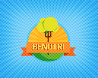
Description:
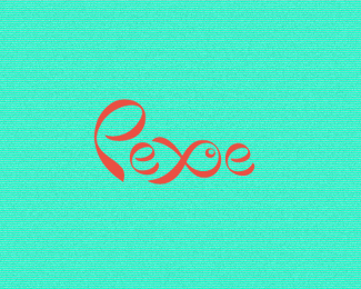
Food and nutritional supplements shop from Brazil. The concept is base on a Fork/Tree :)
Status:
Work in progress
Viewed:
5550
Share:


Lets Discuss
Nice breno!
ReplyThanks, Mate! any suggestion?
ReplyIs there a subtle half-tone texture? I find that a bit distracting. Besides that though, it's really great. Love the colors.
ReplyIts not a half-tone texture, but theres a texture :) *Thanks for your imput buddy!
ReplyOn second thought, you could probably use a bit more contrast between the top of the tree and the background.
ReplyAwesome mark... but I guess the colors are too soft that blend with each other...
ReplyThanks, Libran005 i'm working on it right now! :)
ReplyVery nice Breno!
ReplyGood execution nice texture! fork/tree remind me this: http://logopond.com/gallery/detail/65881
ReplyDamn, agree with you dado!
Replynice %26 dream
ReplyPlease login/signup to make a comment, registration is easy