Description:
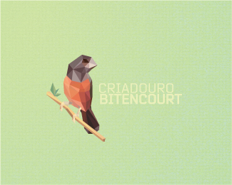
A work in progress for a hatchery of finches (this bird specie is called 'Curió' here, anyway the translator say 'Finches') in my hometown, Paraguaçu Paulista. (the owner is my cousin, so the name probably will be Bitencourt's Hatchery, 'Criadouro Bitencourt' in portuguese). So I hope you like it, and I hope it isn't illegal too :D (I'm just kidding, all stuff is legal)
In fact, i'm not a big fan of this kind of stuff. :/
Status:
Work in progress
Viewed:
20323
Share:
Lets Discuss
it's....
Replygreat bird
ReplyLike it :)
ReplyThank you mates :)
ReplyI'm not a fan of the trend, but your logo is a real beauty! Very nice coloring.
ReplyThank you Nikita! coming from you that means really a lot! :)
ReplyThe font color is way too light, but this is striking from afar and close up.
ReplyI guess you should increase a bit the contrast with the background, but besides this the bird is awesome! And i'm a fan of this trend! :D
ReplyThank you Tass and THEArtist! I'm glad you like it!*I'm thinking about yo use this on a whit bg, so the type will be green, and with more contrast.*
ReplyWow, great work
ReplyHey Breno, this mark is quite lovely, as is the rest of your work, and it's evident that you've put a lot of time and effort into this. However, I'm not sure that this faceted execution trend is the right approach for this brand. To me, when I see this type of execution, I think 3D-rendering%3B ray-tracing%3B technology%3B hi-tech%3B computers%3B digital%3B electronic. When I look at this logo, I feel like it should be for some sort of 3D production studio. Like Industrial Light %26 Magic. But, in fact, what you're actually designing for here is a real-world finch hatchery, which is as far from the digital world as you can get. To me, a more organic approach would be best suited for this brand. Something that captures the essence of a *real* bird, not a synthetic bird.
ReplyThank you for your imput, Atomicvibe! :)*
Reply%22this is one hell of a show!%22 - YES! Really great ilo. I want this on my wall!
ReplyGreat art. It reminds me a bit of origami :)
ReplyAwesome work, Breno.
ReplyFloat %3B)
ReplyThank you, guys! :)
ReplyReally like it!%0D*%0D*%0D*
Replygreat stuff!
Replyoh yess!!! bravo!
ReplyLooks very good
Replyfav
ReplyBeautiful illustration! Full of harmony!
ReplyYes, very cool!
ReplyAdded to faves, love the design and colours!
ReplyVery cool Style,, Love it
ReplyLindo!
ReplyPlease login/signup to make a comment, registration is easy