Description:
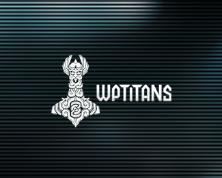
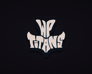
This logo I've developed for a company that sells WordPress themes and plugins, high quality stuff at an affordable price. The concept behind this logo is called Mjölnir, or Thor Hammer.
Feedback is very much appreciated! :)
Status:
Work in progress
Viewed:
5381
Share:
Lets Discuss
crazy stuff:)
ReplyThank you, Deividas! :)
Replylove the detail, Breno. all nice.
ReplyThank you so much, Mike. I'm working on the spaces between those pieces, and coloring now. :D
ReplyVery nice detail work Breno
ReplyThnak you Justin. Im trying to simplify a bit more, to get clear. :)
ReplyReally nice stuff.
ReplyThank you, Nick! really appreciated, buddy. :)
ReplyEPIC !!!
Replycool lookin breno!, great work
ReplyThank you so much Hayes and Florin!*I'm glad designer with your caliber like it, mates :)
ReplyHow could someone not like it?
Reply%5E Liked and floated, Stelian.
ReplyThank you Lecart and Milou! :D
ReplyVery nice %22Hammer%22 and font works really good with each other :)*(only the %22p%22 in my opinion is out of balance)
ReplyThank you, Buro! *Do you have any suggestion to fix the 'P' ?*I've tried make the superior left 'corner' more angular, but doenst looks really good...
ReplyPlease login/signup to make a comment, registration is easy