Description:
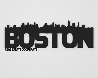
Did it for a contest. ;)
Status:
Unused proposal
Viewed:
1811
Tags:
boston
•
building
•
co operative
•
real estate
Share:
Lets Discuss
Guys It's my first logo work.. So don't be so hard.
Replyinteresting concept, you need to tighten the kerning between the 'sto'and dont let the city dip into the N in my opinion. If you do then make it white pipes under the city so when its small or far away it looks like the nest of the N
Replyalso id make real estate cooperate larger and as long as boston and move it down some
Thanks Climax. I made the changes and did upload the ogo in my behance profile. www.be.net/viivi
ReplyPlease login/signup to make a comment, registration is easy