Description:
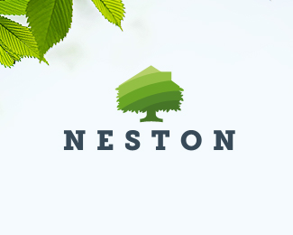
Logo for NESTON developer.
Status:
Client work
Viewed:
4929
Tags:
green
•
leaf
•
tree
•
home
Share:


Lets Discuss
it looked like the trunk of the tree is a serif font base. why didn't you use that font for the name? or go completely opposite and use a sans serif? it does feel like the font choice for NESTON is not quite right. otherwise I love the house/tree mark. unique idea as far as I know.
ReplyPlease login/signup to make a comment, registration is easy