
Description:
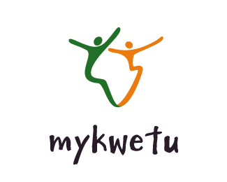
My client is dynamic female lawyer starting a consulting practice we could not put law firm in the words so the design had to echo that essence.
As seen on:
www.agentorange.co.za
Status:
Client work
Viewed:
1884
Share:

Lets Discuss
simple and effective, thought to be honest I dont get a 'feminine' sense of the logo if that was the intention. Still I like it and it gets a float.
Replyi was hoping the Feminine sense would come through in the curves, the positive negative shapes fitting into each other?
ReplyI think its the color, green and grey, classic army camo! Sorry brandon, I think an alternative color scheme would really set it of, or maybe loose the grey?
Replyok that is a good point thank you
ReplyPlease login/signup to make a comment, registration is easy