Description:
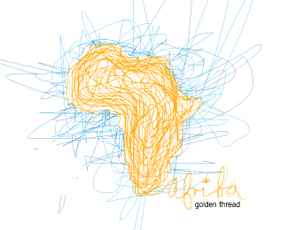
This was just a play around concept i liked the idea of creating a logo out of just 1 line, this however is not the case here, it evolved into something else, not entirely sure it works but it is a start i think i am going to go back to drawing it by hand and then scanning it to give it more a hand drawn feel, any suggestions throw them my way!
As seen on:
www.agentorange.co.za
Status:
Just for fun
Viewed:
2615
Share:


Lets Discuss
What?
Replynot my best logo :(
ReplyIt really looks like it was created with MS paint. Not saying you shouldn't try new things but... One major improvement would be using an established font for the word 'Africa'. My two cents...
Replylol, ouch... agreed
ReplyPlease login/signup to make a comment, registration is easy