Description:
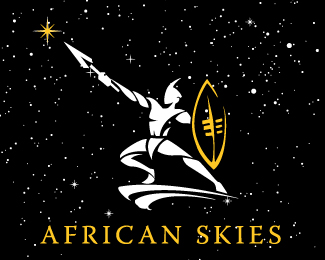
This logo was an idea i had. There was no client at the the time. Then our client African skies step into the studio and i knew this was going to fit perfectly. The only additiona i had to make was the stars. what do ypou guys think?
As seen on:
www.agentorange.co.za
Status:
Nothing set
Viewed:
1352
Share:
Lets Discuss
I really like it, the twists in the right arm bugs me a little though...
ReplyAgreed, no background would improve its presentation. I think it may be stronger in a single color instead of white gold.*The head piece seems uncommon, from what I've seen at least.. makes him a bit more bad ass than I think he could be. Im sure you have more knowledge on their attire, but thought I would add another point of view.
Replythnaks guys for all youe comments, climax you are right the head is a faether, i do agree the forarm could be refined. The starts need to come out as well and i will try a one colour logo.
ReplyPlease login/signup to make a comment, registration is easy