Description:
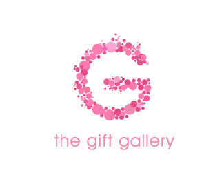
This logo was designed with inspiration from 3 logo's to be found on this site (big up to you guys), the same concept of small bubbles making up a logo. We wanted something iconic and and girly but that would appeal to men if needed.
As seen on:
www.agentorange.co.za
Status:
Nothing set
Viewed:
6006
Share:


Lets Discuss
The mark's great, i'm not 100%25 sure over the typeface. It's pretty.. concepts quite popular.
ReplyNice mark! I'm not sure that it will appeal to men, but I'm a woman, so who am I to say? %3B)
Replywe actually gave the client that flower option they said they are not florists, hence
Replyuse ribbons maybe? gift boxes usually have dat
ReplyWhat about boxes? I like this.
Replyhi Brandon, a mark I put together was linked with yours, feel free to check it out,http://logopond.com/gallery/detail/35898**I think I prefer yours tho, more detailed / more depth...
ReplyPlease login/signup to make a comment, registration is easy