Description:
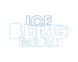
The client had one rule for me when designing this logo. NO COLOUR GRADIENT in the logo. Flat vector it had to be.
As seen on:
www.agentorange.co.za
Status:
Nothing set
Viewed:
1474
Share:


Lets Discuss
I like it! It does inspire the coldness of an iceberg, indeed.
Replythnaks lecart, i was a bit frustrated that i could not use any colour gradients in the logo
ReplyErr... Looks an awful lot like Sanyo's under the sea campaign.**http://www.fubiz.net/2009/04/24/sanyo-under-the-sea/
Replylev88 are you crazy my logo looks nothing like that, in its design style or execution! The concept of an iceberg is universal, sanyo don't own it.
ReplyYes, the concepts are similar, but Brandon is right about style and execution. I would also add intended use. One is obviously not meant to go beyond a limited use poster layout, whereas one is designed for and meant to be a broadly used and long term logo.**That being said, Brandon, this comparison is going to be made. Don't be quite so overly reactive (been there). Levi88 just wants to make sure you are aware of what is already out there. There is no guarantee you won't get flak or even sued because of the concept's similarities.
Replythe artistt with all due respective, one is a illustartion and mine is a flat vector logo, taken from the common knowledge and or principle of an iceberg 30%25 you see 70%25 your don't because it is under water, there is no copyright on that principle.... now if anybody has constructive crit on how to better this logo i am all ears
ReplyI would probably thicken up the line weight just a tad. That light blue will disappear at small sizes. I'd also probably put a continuous line at the water line. But the logo is smart as is.**You are a touchy one, aren't you. Your design work is solid. Relax. :)
ReplyOh, I noticed the space between the R and G over the space between the I and A is awkward. I know the tracking is good, it is just the way those letters go together and it is compounded by them being over each other. Maybe try using a font with an R that has a different descending leg to fill some of the open space. Just a tiny critique really. Is that font Avant Guarde?
Replythanks theartistt for the feed back i think you have made some valid suggestions...
ReplyPlease login/signup to make a comment, registration is easy