Description:
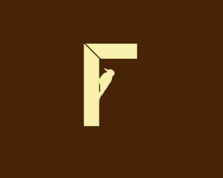
An idea Im playing with for Finishing Touch,which is a carpentry and millwork company.The eye is now gone:)
Status:
Nothing set
Viewed:
15721
Share:


Lets Discuss
Amazing concept Fabian!
Replyvery cool great concept
ReplyIt reminded me of a gallows when I saw it as a thumbnail, but it's nice anyway.
Replyvery nice... is the top meant to be disjointed like that?
Reply@dache %26 kaimere,thx guys. **@Yglo,gallows..nah..see below**@nido Yes, in carpentry it is know as a mitre joint.
ReplyRefreshingly simple. Nice idea.
ReplyIs there a way to make it look more like an F?%0D*%0D*Or are you not even leaning that way?
Replythats an idea... what does it look like with the birds wings out? did you try that? :)
Reply@ firebrand Cheers bro*@ Craven91 ,a finishing touch to me is that little bit extra added to make something special...so I don't want the F to be obvious,but to be implied.*@nido Please see above*
ReplyThis also looks like one of those 90 degree angle rulers (or whatever they're called) carpenters use. Very clever Fabian! But imo, the eye can go on the bird. Cheers.
ReplyHey funny you should say that about the birds eye,my wife just said the same thing...clever cookies.Thx
Reply%22@ Craven91 ,a finishing touch to me is that little bit extra added to make something special...so I don't want the F to be obvious,but to be implied.%22%0D*%0D*%0D*If your client buys this nonsense - kudos.
ReplyThx Jon.**Whoa!...Im in the gallery,thank you for the nod of approval guys:)
ReplyThis concept is makes me wish I would have thought of it!...srsly, this is a great idea.****peck peck peck peck
Replycheers mate!
ReplyBrilliant idea, my friend!! And a clever touch with the mitre joint. Yeah, lose the eye. :)
ReplyThx Ocularlnk,the bird got a splinter in the eye...%3B)
Replyvery nice !
ReplySimply effective! :)
ReplyFabian...It seems your mitre joint is off a tad. It needs to be centered perfectly in the corners to be square. Other wise the finshed piece will not be square, if this was a table or a window. Other than that nice concept.
Reply@sandhya thx mate**@ senterbrands*Great eye Bart!,cheers for that:)
ReplyThanks for the love all.I see this has made,Best mark,Best concept,Best layout.cheers guy!
Replyyeah, but the typography sucks ha ha.
ReplyYep, it's going right up the pecking order.
ReplyI like it and think the bird to make the F is brilliant. But I don't like the miter joint. Did you try other joints? Like a butt, dado or splice? Or even show a bit of dowel or biscuit, maybe? Just saying.
ReplyNow that's a concept.
ReplyThank you mabu:)
ReplyJust been featured on %22abduzeedo%22:http://abduzeedo.com/ultimate-one-color-logos-inspiration
Replyprobably my fave of yours Fabian! awesome
Reply%22Interview on LogoGala%22:http://www.logogala.com/gallery/details/finishing-touch
ReplyReally nice. I like the contrast between the simple lines of the wood and the detail in the woodpecker, it helps your eye to distinguish between that there are 2 separate two shapes.
ReplyCheers buddy:)
Replygreat concept mate
ReplyYes, this one is fantastic, Fabian! Surprised to see I hadn't commented on it before.
ReplyThanks boys! Great to see ole woody still pecking away.
ReplyI feel violated..LOL*http://www.wolda.org/showcase/logo/3459*
ReplyWow. Now that is not an idea I would have thought more than one person would come up with. Hate it when that happens, eh? Yours is still hot though.
ReplyI know what you mean Fabian - time to change my fahrenheit logo: http://www.wolda.org/showcase/professional/2009?page%3D2**Overall I think many of the winners are quite mediocre and it makes me laugh when they make statements like 'Best of Europe' It has done nothing to convince me to shell out big bucks on entry fees. I'll stick to Logo Lounge and Logopond.
ReplyYou guys should contact them to let them know, that's pretty sad for a big organization like that to not know.
Reply%5E I'm with Roy here. Shocked to see overall lack of quality in winners section... There are few really good ones, but also a ton of material that will certainly go pretty unnoticed here for example... If i read correctly, judging was done by submitters there? Also, there's a lot of unoriginal (rip off?) entries as mentioned...
ReplyThanks for the support guys. Roy's spot on! I generally don't take part in %22paid%22awards, they tend to have a overall lack in quality work. I have contact Wolda about my issue and I will keep you all updated.
ReplyAs of yet there has been no reply...very disappointing:(
ReplyMARAVILLOSO!!! Lo dice todo
ReplyTome gracias, estoy contento de que te guste.
ReplyPlease login/signup to make a comment, registration is easy