Description:
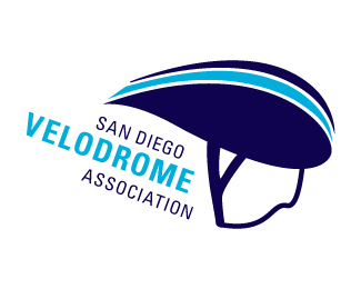
This was a case study for the San Diego Velodrome Association. The lines of the helmet are meant to mimick the outdoor track/arena of the velodrome.
Status:
Student work
Viewed:
1497
Tags:
branding
•
racing
•
Cycling
Share:


Lets Discuss
Please login/signup to make a comment, registration is easy