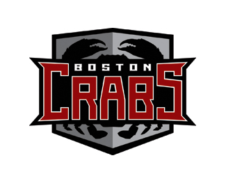
Description:
The Crabs desperately needed an updated logo, but under a tight timeframe (3 days). The existing color palette needed to be used, but the artwork was completely open to redesign.
Status:
Nothing set
Viewed:
3953
Share:

Lets Discuss
it would be kind of neat if you saw more of the crab
ReplyTrue, but it does start to get very complicated, the more parts of the crab you include. **Plus, take into account this will probably be embroidered or printed on fabric, stickers for helmets, etc.
ReplyAny feedback from you guys would be great - even if you want to bash it, bash away! I can take it.
ReplyMy first thoughts, the same as gyui and eliminate the shield. Has much potential.
ReplyMaybe even slightly arch the type and reverse the colors?
ReplyCool, I'll try reversing the colors and arching the type.**But eliminating the shield and keeping the crab would be problematic for embroidery and printing on fabric. And just having the type seems like not enough, idk.
Replywhat about a more illustrative version of the crab instead of a more literal version?
ReplyPlease login/signup to make a comment, registration is easy