Description:
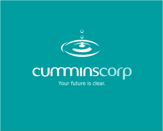
Logo pitch for a major corporation. This company will supposedly change the world's view on water consumption. Their technology in water remediation (turning muck into water in its purest form) have put this company in the ASX. They will be going through a whole new reburbishment of their corporate identity and have asked me amongst others to pitch. I have spent almost a month on this. Your comments would be most valuable. Cheers.
Status:
Nothing set
Viewed:
3755
Share:



Lets Discuss
Hi Chanpion, its a very nice job and its well executed. The mark is lovely but I have seen it a few times in other logos (the first logo lounge book has examples, I think) buts thats not to say it cant be used here. I like the typography but am unsure of it been in italicied as the motion of the mark is going evenly out and up (the ripples and the drop) and then you have the logotype going forward I feel if it was static it would have more balance. the choice of typeface is nice but is that a freebie font, is there different weights that could be used? its a very familiar font..., would the likes of 'Klavika' 'MIC 32' or something similar be worth looking at? The colours are beautiful...apart from all of that I would say that you have a stong case...I would be very proud to have this in my logo portfolio. I hope these comments are helpful, good luck!!!!
ReplyThank you for your insight Paul. I know the mark have been used in other logos but unfortunately this company had a photo of a waterdrop/ripple in their previous identity and they want to keep the same image. Therefore I vectored this new image for them but also incorporating a stylised 'c' into it. I have updated the logo so the type is not italic. You have made a very valid point in regards with the balance of the type and the mark. It now looks much more balanced. Many thanks for that! I have studied many other fonts for this and I still came back to this one as it was smooth, clean and still had a corporate feel. I've tweaked it by getting rid of the dot on the 'i' and Ken Cato'd the m's.**Thx again for your input. Much appreciated mate.
Replygday mate! chan the man... chan the man... what can i say.. chan the man... buddy, i like you... %26 i like this... but... ok, first off do they really want to keep the same image? i mean REALLY want to keep it? what about the same image but with a different take? for example... droplets coming out the bottom too? to show a process? or maybe the droplets themselves create a 'C'... ok i dont know thats off the cuff, maybe they dont wanna change it, just a thought. its just that, dude, we've all seen it before %26 taking NOTHING away from your talents (i wouldnt dare) its not original! know what i mean? im trying to be constructive here dude! sorry if i ain much help! just take thier original image %26 run with it... the other thing... %26 this is nothing you can help but 'CUMMINS'corp %26 then droplets!!! (man maybe im sick???) all the best dude, I hope you get it it mate... know your more than capable!
ReplyLOL...haha....I nearly pi**ed myself man! You are a very bad man and setting a very bad example. Summaya should stay away from you! Mate, the feeling was mutual with the so called puns that you meticulously pointed out! But hey, its the big boss' surname and with the money he's making, I don't mind being called that minus the 'MINS'! (ok, might be going just a little too far there.)**Anyway, back to the topic. Mate, you should have seen the brief. Everything was laid out like a surgery table! If you derive from what they expect just a little bit and try to go out on a limb, you might as well have no limbs! The head honchos have painstakingly invented this groundbreaking technology and have since been listed in the stock market and have built up an image they wanted to maintain. They basically just want to pretty it up and update it 'abit'. And dude, I definitely get ya man. I had EXACTLY the same concept in mind with regards to your droplets showing a cleansing process. But hey, I just want the rest of their promotional design work! Fingers crossed and thx again man.
ReplyHowdy Chan...IMO it looks great...as for the typeface its working much better now, I feel both elements would work just as good on their own as they do together...as for the mark, yeah it has been used before and theres nothing you can do about that, if thats what the clients wants...but its nice that you incorpareted the C, its a nice bonus...great work! hope ya get the gig...
ReplyVery nice logo! Colours look great! Much better without italicied type. Very sorry to say that I don't really like the %22c%22... May be, you could try to re-built it, making it more horizontally symetric... The %22s%22 seems also too condensed comparing to the others... Just thoughts about your work which looks (as always) great!
ReplyThis made me chuckle
ReplyPlease login/signup to make a comment, registration is easy