Description:
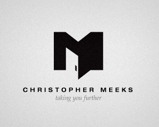
This is a new identity that I put together for myself. I know the "M" icon has been done to death, but I am hopefully trying something a little bit new this time.
As seen on:
Status:
Client work
Viewed:
1156
Share:
Lets Discuss
Very interesting approach. I like the depth you've created with such simplicity.
ReplyCan't agree more! Clever!
ReplyThanks both for the comments, both of you have excellent work (this is the first logo I've uploaded). So I certainly appreciate your perspectives!
ReplyMaybe it's just my monitor, but it looks as though the top of the door doesn't quite match the angle of the %22M.%22 Also, have you tried other versions of a door handle? I don't mind the rectangle, but maybe there are other shapes you can use. Looks great though.
ReplyI'll double-check that angle, you may be right on that.**I didn't try other versions of the handle just because I thought this would fit the letter the best, but I'll look into it.**Thanks for the feedback.
Reply* Note: You were totally right Thrasher, it was a little off. Good catch! Thanks!
Reply:)
ReplyThis is fantastic! I really like how you settled on a square door handle too to keep allt he shapes and angles in unison. Very nicely done.
ReplyPlease login/signup to make a comment, registration is easy