Description:
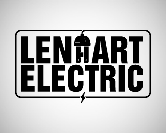
A customer came in today wanting just basic letters for his van. I was told not to make a logo so of course, that inspired me. I think maybe the "H" is hard to read but when I made the prongs the same as the "H" from the font then the top plug part goes too high and it doesn't have a nice border around it. What do you think?
Status:
Just for fun
Viewed:
1319
Tags:
Plug
•
Electric
Share:
![More Than A Cookie [brownie]](/logos/2314cd161d4c2c6a88dcfbac9b68168e.png)
![More Than A Cookie [cake]](/logos/9dffd77de347dc7c9ad2fbe4dea7fc51.png)
![More Than A Cookie [gingerbread man]](/logos/cfe81bf10fa09576763564d09ff483c8.png)


Lets Discuss
Please login/signup to make a comment, registration is easy