Description:
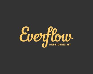
chosen concept for 'Everflow', a company that solves labor law conflicts between employees and small companies. "arbeidsrecht" is a dutch word for labor law.
As seen on:
Colin Tierney Design
Status:
Work in progress
Viewed:
8569
Tags:
typography
•
lettering
•
logotype
•
custom
Share:
Lets Discuss
I actually prefer this version, the other had more energy (emphasis on 'flow') but this fits a lot better in a corporate/legal setting.
Replyi'm with ya josh. the client and i both agreed that this word mark was better suited for their business. i think i let myself run free with the other concept. sometimes this will happen unconsciously when i provide my clients with more than one option.
Reply'sometimes this will happen unconsciously when i provide my clients with more than one option.'
ReplyI hear ya.
Winner!
Replythanks, alen.
ReplyNice work. Bit too informal and different for a law firm but different is good, it'll standout among the boring 10000 other law firm identities. there are some awful ones out there.
Replyabi, bingo! informal was actually used within the client brief as something they were looking for instead of using a serif typeface like most of their competitors do.
ReplyDid you disconnect the 'f' and 'l' on purpose? That was the first thing I noticed. This logo is stylish, yet still bold. It will definitely stand out. Good job!
Replybram, i did. without the break, i was afraid the ligature would have made the 'fl' look like an 'H'. thanks for your comment.
ReplyYou're right, that doesn't work at all. I just thought, what if you connected the 'r' and 'l'? Sorry if you already tried that, just thinking out loud. :P
Replythanks, bram. i'm pretty happy with the way it is now.
ReplyPlease login/signup to make a comment, registration is easy