Description:
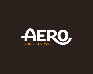
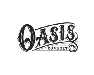
Hand lettered logotype for a furniture company based out of Moscow, Russia. I wanted to portray their identity with one that reflects a geometric foundation. The crossbar of the 'A' shows stability while the leg of the 'R' hugging the 'O' evokes comfort. I created rounded terminals to each letterform to give an inviting and friendly aesthetic. This juxtaposition between geometric and organic elements within the characters allow for a compelling image that directly relates to the business model; comfortable and durable furniture.
As seen on:
Colin Tierney Design
Status:
Client work
Viewed:
5276
Share:

Lets Discuss
Please login/signup to make a comment, registration is easy