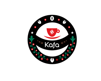
Description:
Kafa new Premium Coffee selling fresh robust 100% arabica from around the world. Client want something diffrent more elegant and traditional. CIRCLE will be stamp as etikete on one-colour coffee packages. I wanted to put Cuba, Russo-Serbian-Partizans feeling.
As seen on:
Communication Agency
Status:
Work in progress
Viewed:
5304
Share:

Lets Discuss
Lets taste new Kafa!
Replyit has its style
ReplyThanks Patriciape!
ReplyUpdated!
ReplyOh... thats ...different! I like it!
ReplyThanks watermarker
ReplyI am drinking now Kenya 100%25 arabica so strong for mornings when u going to bad in 3 hours in morning.
Replythanks chrystian and to all floats
ReplyThis is refreshingly lively, which is how I want to feel when I drink coffee. As an avid coffee enthusiast, I really appreciate your thoughtful concept, in which you visually chronicle the entire life of the coffee experience. From the raw coffee cherries, to the roasted beans, to the cup of steaming hot java, I really feel like this logo tells a story, which is a pretty amazing feat for such a simplified design.**I have a few suggestions:**1) I feel the type could be better integrated into that curved, horizontal band. Perhaps the type could be hand-built (or skewed using the Arch Warp Effect in Illustrator) so that it mimics the curves.**2) To me, the bottom half of this mark feels very heavy in comparison to the top half. Maybe try adding more roasted beans on the top half to counterbalance the amount of coffee cherries at the bottom.**3) The brown beans in the center don't read well on black. Perhaps you could try either lightening the brown on the beans, or try a less stark black. Maybe a nice warm medium-dark gray?
Replylike it ... what more can I say ... av did already a great job %3BD
ReplyO atomicvibe very nice letter. I using corel x5. I carfully readed ur sugestion.*3) same feeling*2) i wanted to be bootom heavy and up lighter with cup of coffe to make balance*1) type can experiment
ReplyBernd thanks a lot again!!! KISS!
ReplyVery nice style!
ReplyThanks a Cappuccio
Replygreat colors! Looks more like an illustration though than a logo. It doesent look like it would scale well.
Replythanks matt
Replynice colours :%5D
ReplyThanks a lot jands new energy to new week
ReplyPlease login/signup to make a comment, registration is easy