
Description:
Early childhood store.
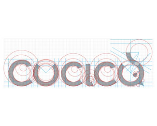
The logo has been designed in such way to result soft and modern and to recall a childhood.
The symbol, extracted from a letter 'u', represents a chick commonly associated with newborns.
The font has been designed ad hoc to dialog with the symbol on its form level.
As seen on:
Concreate Studio
Status:
Client work
Viewed:
1070
Tags:
Type design
•
Typography
•
Type based
•
Child
Share:


Lets Discuss
Please login/signup to make a comment, registration is easy