Float
(Floaters:
5 )
Description:
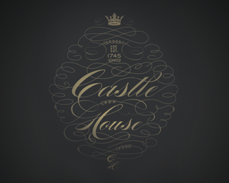
Logo for an elegant and quaint hotel in England.
Status:
Student work
Viewed:
1314
Share:
Lets Discuss
While a nice design, I think it's a bit to intricate to make a good logo. While it'll look beautiful close up, or large sized, but if it's small, or far away, you're not going to be able to see the detail, and it's a bit difficult to read such swirly text, especially since the crossbars of the H and t are to hard to see...I thought it said mouse at first, not House
ReplyI agree with Gwendolyn. Very beautiful but detail is so fine it's hard to read. The sepia on gray probably isn't helping. But again, beautiful.
ReplyThanks for the responses, this justifies my worries about the legibility and that's why I ended up going a different route with this one.
ReplyPlease login/signup to make a comment, registration is easy