Description:
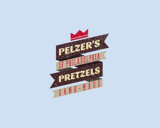
Created for a Philly-based pretzel shop located in Brooklyn.
Status:
Unused proposal
Viewed:
9718
Tags:
logo
•
grungy
•
ribbon
•
retro
Share:


Lets Discuss
I think it would read better if you switched %22hand-made%22 and %22of Philidelphia%22. Interesting nonetheless.
Replyagreed %5E I like the bold font..
Replywow! Finally, my first logo in the gallery!**Well Sam, %22hand-made%22 is more like a motto, so I had to put %22of Philidelphia%22 there to respect the name of the brand.
ReplyMan, I don't think I'll ever tire of well-executed flag/ribbon motif logos. This one is great. I really dig the type, and I love how the texture of the brown flags is reminiscent of pretzels. I agree with Danny and Sam about the placement of the words 'hand made' and 'of Philadelphia,' but I totally understand that you placed them where you did to respect the official name of the brand.
ReplyThanks atomicvibe!
ReplyPlease login/signup to make a comment, registration is easy