Description:
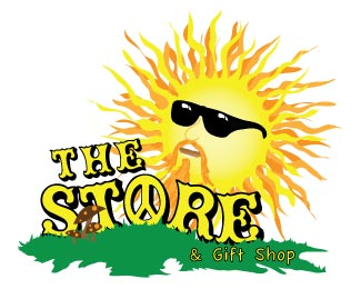
The store is a smoke shop; it is very eclectic and laid back. I chose the fonts to create a fun atmosphere. The sun represents good times and happiness. The green grass and mushrooms give a natural feel to the composition.
Status:
Nothing set
Viewed:
805
Share:




Lets Discuss
I definitely think of good times when I see this logo. I like the way the font follows the %22land%22. I also like the colors of the sun. Great job as always.
ReplyShrooms %26 a peace sign ... far out man. %3B) *This logo just makes me happy Darin. I know I already told you this, but the font works ... I love the peace sign as the %22o%22 ... the mushrooms are great ... the the sun is well, groovy. %3B) Amazing job.
ReplyI dig it Darin!
ReplyThis makes me feel happy lol. I like it man. I'm not sure what %22The Store%22 sells, but this would be great on a, um, bong store. lol. It screams Hippie influence, right down to the mushrooms. It's very well done. Love it.
ReplyPlease stop this nonsense. It's just the same person posting under different user names.
ReplyThat would explain a lot...
ReplyThere's a little too much sunshine going on here, if you know what I mean.
Replybarryconvex%3B to start with I am an honest person posting on this website looking for opinions on how to improve my design skills and it just so happens that yes we are all classmates fulfilling a lesson obligation. Please keep your comments professional and focused on what this site is used for. If you would like to comment on my work and give helpful advice as to how I might improve please do so.
ReplyI have been to The Store and honestly I think this is pretty much perfect! Considering everything they sell there and whatnot, it definitely works better than the logo they have on their business card. Your illustration is beautiful as always and the font really does work, kinda reminds me of %22That 70's Show%22 for sure! Awesome work as always Darin!
ReplyThis is to complicated to be an affective logo. The illustration is great but for a logo it doesn't work. This is just my opinion but I would scrap this and start over.
ReplyIt is complicated, but before scrapping the whole design, perhaps you should simplify it. **Why don't you use the sun with sunglasses as a central element and work a similar, suitable type solution to work with it? And ditch Comic Sans for the subhead font.**Additionally, the sun needs more contrast and definition to read better. The colors at the moment are a bit glaring right now. No need for using the grass, just focus on the hippie sun mark.**Hope that helps.**
ReplyThank you sir , I will surly give that a try. I need to think simple, simple and memorable.
ReplyI love the Sun and some how you always put yourself in the design. You always seem to amaze me Darin but I do agree its a little much for a logo but It still fits for the concept. I do see them using this as there logo though. Great work Darin
ReplyI agree about it being a little too complicated, but I love it...I just wow...the sun looks great, the font is awesome, great job Darin.
ReplyBeautiful illustration, not so great for a logo. As said before, it just needs to be more simpler in design. I do love the way this looks though. You are awesome!
ReplyPlease login/signup to make a comment, registration is easy