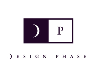
Description:
Hello All...I just signed up, so I'll start by loading my personal logo. It was featured in “Print Magazine” a few years ago and also in their hardback book called “Print's Best Logos”...I'm finally getting ready to design my website (long overdue...did someone just say procastination? hmmm...)
Status:
Nothing set
Viewed:
9651
Share:

Lets Discuss
hi there....like you - just signed up so thought I would comment! I think this is a very strong logo...personally I don't like serif faces but that's just me! I love the idea of the use of a moon shape based on the name being %22phase%22. good luck with the rest of your work....like you - I am procrastinating to get my website up!
ReplyI think it's great. And it's the perfect serif font, (Trajan?) 'cause the open curve on the P matches the crescent moon.*nice one!
ReplyHi...it's actually Sabon. The P was barely open, so I tweaked it to a more dramatic open position, and shaped the ȁCP'sȁD pointed-tip shape to match the ȁCD'sȁD pointed-tip shapes. Thanks!
ReplyHi...it's actually Sabon. The P was barely open, so I tweaked it to a more dramatic open position, and shaped the P's pointed-tip shape to match the D's pointed-tip shapes. Thanks!
ReplyI keep wanting to see Dreamworks pictures on this one. You know everytime I see this all I can visualize is the little boy sitting in the moon.
ReplyThanks for the comments.
Replynice!
ReplyI like it.%0D*%0D*%0D*%0D*
Replyvery interesting
ReplyThanks again for the comments.
ReplyPlease login/signup to make a comment, registration is easy