Float
(Floaters:
51 )
Description:
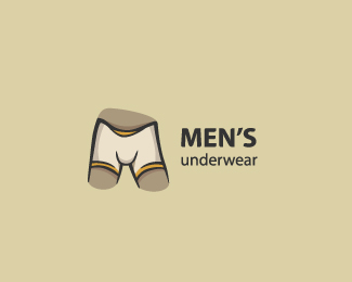
Idea is a boxers and M letter in one.
Status:
Client work
Viewed:
12014
Share:






Lets Discuss
Must be cold :)
Replyvery very cool! :D
Replygood idea, love the font too
ReplyI'm just being honest here so don't take it personal. I'm looking at this from a user view and not from a designer view. I think it's WAY to funny/clever to ever represent an actual %22brand%22 If your looking for kudos in the clever department than it works. If your trying to actually design for something that can be usedd in the market and 'branded%22,.. I think you need to go back to the drawing board.
ReplyI see a side profile in the letters US...intentional?
ReplyHa! Funny stuff! %3B)
ReplyHey, thanks for all :)%0D*%0D*Mike, I agree with you. It's not the best solution, there was just a very hard to make something for this theme. Of course client liked it, but rejected because there is too much of cartoon. And thank you for your opinion :)%0D*%0D*Ha, dbunk, it wasn't intentional :)
ReplyYa nice concept, but I can totally agree with your clients and that was the point I was trying to say. Too cutsie wootsie as seems the current trend these days though.
Replythis one cracks me up its a good kid logo but i dont think it would be good for a corporate logo.
ReplyThanks to everyone :)%0D*%0D*Updated project. Sold on Brandstack with a new name. :)
Replythis thread, along with the happy ending, marks the demise of something -- I just can't put my finger on it
ReplyCoool!
Reply:D
ReplyCool concept! I'm suprised anyone would brand their product %22mens underwear%22 though. Perhaps with that in mind, a literal representation of the product isn't such a bad idea afterall!
Reply:D nice concept ..
ReplyWith interest has read %3CA href%3D%22http://Sputnikkey.ru/%22%3E.%3C/A%3E
Replysuper!!%0D*surrealistic style?)))%0D*
Reply@webcore I believe Matto replaced the actual name of the company with %22Men's Underwear%22 to watch his @%24%24
ReplyPlease login/signup to make a comment, registration is easy