Description:
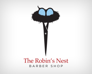
Barber shop logo
As seen on:
Doubleacreative
Status:
Client work
Viewed:
14110
Share:
Lets Discuss
Added the copy. This might represent better.
ReplyIn short - Not only does this hit the brief on the head...it goes to its house %26 karate chops its Nanna.
ReplyHa, Thanks guys. I appreciate that.
ReplyWow, what a great image. Good work, and very clever!
ReplyThank you : )
ReplyWOW, so smart. Great concept, flawless execution.
ReplyThe only thing I want to point out, other than the fact that this is amazing, is that since it's a barber shop, the messiness of the nest doesn't send a clean cut message to me that a barber shop image usually tries to express.
Replyat first sight it looked like a naked man doing a handstand ... %3BP no, no, this one is really awesome ... fave !!!
Replyinteresting looks...:)))
Replygreat logo, love the mix
Replyso thoughtful!nice
ReplyThanks for the comments everyone. I appreciate them.
ReplyI realize this was done in 2010, but I couldn't resist. VERY NICE JOB! Added to our current trends in Business Branding at COLOURlovers.com. http://www.colourlovers.com/business/trends/branding/7877/The_Robins_Nest_Barber_Shop**are you a COLOURlover? Thanks!**Molly Bermea*COLOURlovers.com*Community Curator / Blog Editor*
Replynice....
ReplyNice Idea!!!!!
ReplyClever...I'd lose the red on the type (go all black) so it doesn't compete with the blue.
ReplyThank you for the suggestion Logoboom. I will give it a try.
ReplyPlease login/signup to make a comment, registration is easy