Description:
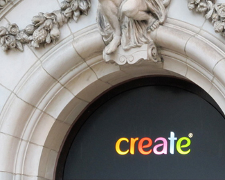
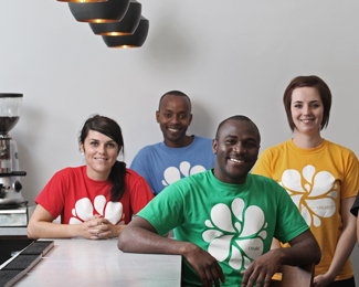
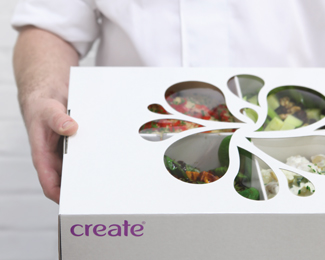
Created for local social enterprise creating 'in-work' training for marginalised people to gain new skills and get a foot back on the ladder. A bespoke wordmark was created and a new 'splash' icon designed. It was rolled out for the catering side of the company first, from packaging to menus to web presence, then onto the contemporary high street restaurant. The new brand is steadily making it's mark on a number of cities in the UK.
As seen on:
www.foodbycreate.co.uk
Status:
Client work
Viewed:
4409
Tags:
•
droplet
•
mono
•
splash
Share:
Lets Discuss
I like the lettering alot, I'm just not sure about the symbol. It is nice as well, but reminds me a bit too much of Kraft Foods
ReplyThanks for the comment. The wordmark is unique as the client wanted a mark that they could call their own. The original mark was Helvetica caps. The new workmark is friendlier, easier on the eye and unique. It includes negative space 'droplets' from the splash symbol in the 'e' and 'a' glyphs. The splash symbol itself is a remnant from the old branding. It was retained, redeveloped and redrawn because the actual staff liked the fact that whilst the name 'create' was associated with people from disadvantaged backgrounds, the symbol didn't say 'I'm homeless', 'I'm an ex-offender' or 'I'm an ex-addict'. It was vibrant, refreshing, revitalising, unique and relatively anonymous. It is generally used in single colour executions such as t-shirts, aprons and napkins. Thanks again for you comments. Personally I think the Kraft foods identity is pretty crude. Way of the mark for what is an established, respectable brand.
ReplyPlease login/signup to make a comment, registration is easy