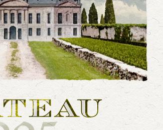
Description:
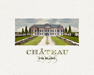
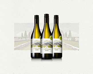
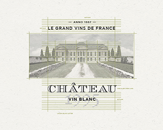
a mark for a wine brand
As seen on:
http://dribbble.com/shots/2504049-Logo-Chateau-for-a-wine-label
Status:
Just for fun
Viewed:
4754
Tags:
•
paint
•
bottle
•
label
Share:

Lets Discuss
Wow, all vectors? Impressive!
Replyno way! this is awesome , i wouldnt mind seeing a process video on how you did it
ReplyI imagine this was done on a rather large-ish scale, allowing enough scope for braning and print. Awesome work.
Replyalso this is just for fun, please teach me seriously lol this is like a goddamn painting
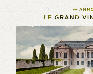
Replywow that is nice, great close ups
ReplyIsn't this just an autotrace of Chateau De Bercy or am I missing something here?
Replyno auto trace is nowhere near this good, I use autotrace like everyday and no way, either this is a vector created image or its a graphic embedded.
ReplyIt's gotta be a live trace, right? Look closer at the Behance link.
Replyit might be, if it s i'd like to know the settings, thats a hellified live trace.
Reply@cream5 so your saying this is too good to be true
Reply@Supamario No, I just think it makes sense to simply autotrace it if you need a vector version of a painting effect given its for a label and labels likely will only be used on a smaller scale. If at all they decide to use it for signage/large scale, then its gonna pose issues if its autotraced because of botches of colors that don't blend like in a painting. You could totally redo this without an autotrace using a gradient mesh to get that blend effect but it would be overkill for a logo given there'd be too many colors and your printing costs would go through the roof.
Replygood research Abi.
ReplyI appreciate the good vibe. I made it just for fun so i hope your'e not to critic about it. (-; There is no secret how to make this. What i did; i created a new scene in PS., trace it and re-done the painting in AI with some coloring, shadows, lightning, depth, scale, etc. etc. I used a lot of different brushes for this. With this brushes i try to create a quality mark with a lot of fine new detail. Just to make it more uniek and for better closer quality. So basically i finish to mark with two layers, the picture i created, and the brush painted layer. Finishing that i used a type what was matching mark, and so it was done. You can do it to (:
ReplyI wanted create a fresh painted mark for a wine brand and i find out that this was the way to do it. I hope you like it, if not, please don't kill me for that! (-; cheers
I also finish a new 'just for fun' project. This time i tried to create much more details design. You can see how i done it. Let me know if you like it. I try to learn everyday. www.behance.net/gallery/33553759/Logo-De-Hoge-Veluwe
Replythats awesome man, the next time you do one can you post a step by step on the brush work, that would be great to see, the behance one you linked here is great, but being able to see the actually transition from the image to the brush would be epic.
Replyagreed^^^^^^!
Replywow, photorealistic
Replysuper nice color blending!!
ReplyPlease login/signup to make a comment, registration is easy