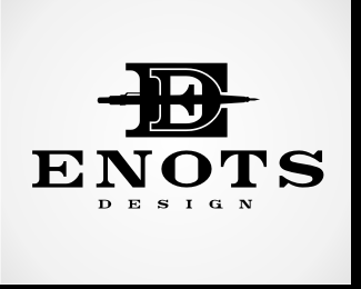
Float
(Floaters:
0 )
Description:
One of the logo marks I use.
Status:
Nothing set
Viewed:
1363
Share:

Lets Discuss
I think you should apologize to %22Mike a.k.a. LogoMotive%22:http://logopond.com/gallery/detail/21134
ReplyDon't wanna sound too cruel (but probably gonna sound that way) but if this logo and Mike's are twins of a sort, then Mike's got all the looks, style and creative streak! This logo just doesn't feel right at all, its just arkward. The E %26 D are fighting your eyes for control and the pen is too exact, a simpler pen shape would have been better, no need for the clip and nib. I'm also surprised that you chose to name your company your surname backwards, I think using Stone as it was would have been better and left you with lots of room for a more creative approach. How long are you established, any chance to could rename and rebrand?
ReplyPlease login/signup to make a comment, registration is easy