Description:
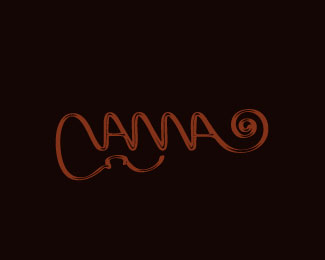
Vanna. Logo for a violinist.
Status:
Work in progress
Viewed:
2433
Tags:
typography
•
beautiful
•
enrique
•
engar
Share:


Lets Discuss
Feedback welcome-
Replypretty interesting.
ReplyThank you Colin.
ReplyClever work!
ReplyThanks Luka. **Any feedback appreciated!
ReplyReminded style logo CNN. And from the first read ANNA. %22V%22 difficult to read, but generally like the logo)
ReplyThanks Sergei, yes you are the second one to tell me the V is hard to read... I need to find a way around it. Thanks!
ReplyMaybe if you draw the upper part of violin and connect it to V, instead of bottom one? Good luck!
ReplyThanks Luka once again! I may try that as well since my fixes are really not working around.
ReplyPlease login/signup to make a comment, registration is easy