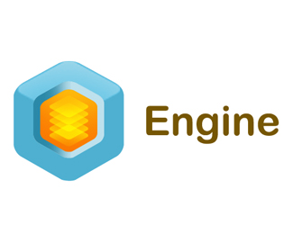
Description:
Logo for real estate software pakket to be launced soon, But I still have an issue with the text/font and name.
As seen on:
Engine -Real estate software
Status:
Nothing set
Viewed:
2597
Share:
Lets Discuss
I see the issue. the name is pretty lame too. the mark is nice.
ReplyI would agree with KGB on all counts. Is there time to come up with a better name? Sounds pretty generic.
ReplyThe mark is good - the 'software' font goes well with it (vag rounded?), but the 'real estate' font %26 colour don't gel with the rest. Plus as kbg %26 leighton have pointed out, the name is not very inspired!
ReplyReminds me of this company I worked for %22smart rent online%22 lol.
ReplyThanks for the comments guys. You are totally right about the name, that is also something where we have to decide on
ReplyDitto all of the above. IMO the fonts conflict with each other. I do like the rounded though.
Replyconflict with those 2 fonts, I think...
ReplyI agree, the name is very generic. I'd say name it after one of the software packages, the last name of the owner, or a combination of both. Sky's the limit there. As for the logo itself. I actually don't see a problem with the different typefaces. The roundness in the emblem I think ties it together for me. But, the emblem should look more like a house a think, maybe.
ReplyPlease login/signup to make a comment, registration is easy